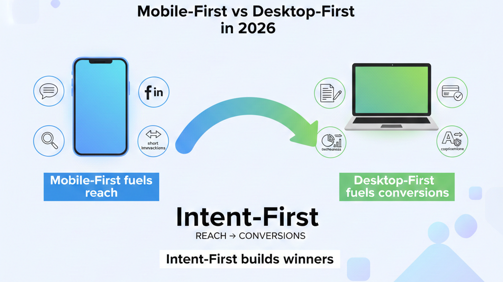
Table of Contents
- Introduction
- What Is Mobile First Design?
- What Is Desktop First Design?
- Mobile First vs Desktop First: Key Differences
- Why Google Prefers the Mobile First Approach
- Advantages and Disadvantages of Mobile First Design
- Advantages and Disadvantages of Desktop First Design
- When Should You Use Mobile First Design?
- When Should You Use Desktop First Design?
- How to Implement Mobile First Design Step by Step
- Real-World Examples of Mobile First vs Desktop First
- Which One Should You Choose in 2026?
- FAQ
- Conclusion
Introduction
When it comes to building a website in 2026, one of the most important decisions you will make is choosing between Mobile First vs Desktop First design. This choice directly impacts your website’s user experience, loading speed, Google rankings, and ultimately — your revenue.
Think about it. Over 60% of all global web traffic now comes from mobile devices. At the same time, many complex tools, dashboards, and professional platforms are still primarily built for desktop users. So which approach should you follow?
In this blog, we break down Mobile First vs Desktop First design strategies in complete detail. You will learn what they mean, how they work, their pros and cons, and most importantly — which one is the right fit for your website in 2026. Let’s get started.
What Is Mobile First Design?
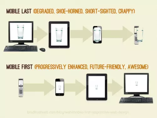
Mobile First design is a web design and development strategy where you start building your website for the smallest screen sizes first — typically smartphones — and then progressively scale up the design for larger screens like tablets and desktops.
The term was popularized by Google’s UX designer Luke Wroblewski in his 2011 book Mobile First, and it has since become the industry standard for modern web development.
In technical terms, Mobile First uses min-width media queries in CSS. This means the base styles apply to mobile screens, and additional styles are added as the screen width increases.
Example of Mobile First CSS:
/* Base styles for mobile */
.container {
  width: 100%;
  padding: 10px;
}

/* Tablet and above */
@media (min-width: 768px) {
  .container {
    max-width: 720px;
    margin: 0 auto;
  }
}

/* Desktop and above */
@media (min-width: 1200px) {
  .container {
    max-width: 1140px;
  }
}
This approach forces designers to prioritize only the most essential content and features first — resulting in leaner, faster, and more user-friendly designs.
What Is Desktop First Design?
Desktop First design is the traditional approach where you start designing your website for large screens first, and then use CSS and media queries to scale it down for smaller devices like tablets and mobile phones.
Before smartphones became mainstream, Desktop First was the default design strategy. It uses max-width media queries in CSS, meaning the base styles are built for wide screens and are then adjusted for smaller ones.
Example of Desktop First CSS:
/* Base styles for desktop */
.container {
  max-width: 1140px;
  margin: 0 auto;
}

/* Tablet */
@media (max-width: 992px) {
  .container {
    max-width: 720px;
  }
}

/* Mobile */
@media (max-width: 576px) {
  .container {
    width: 100%;
    padding: 10px;
  }
}
While Desktop First gives designers more creative freedom on large canvases, it often leads to bloated mobile experiences where elements are simply “squeezed” rather than thoughtfully redesigned.
Mobile First vs Desktop First: Key Differences
Understanding the core differences between Mobile First vs Desktop First is essential before you choose one. Here is a side-by-side comparison:
| Feature | Mobile First | Desktop First |
|---|---|---|
| Starting Point | Smallest screen (mobile) | Largest screen (desktop) |
| CSS Media Queries | min-width (progressive enhancement) | max-width (graceful degradation) |
| Page Load Speed | Faster on mobile | Can be slower on mobile |
| Google SEO Ranking | Preferred by Google | Less preferred |
| Design Complexity | Starts simple, grows | Starts complex, shrinks |
| Content Priority | Forces prioritization | Risk of content overload |
| Best For | Consumer apps, blogs, e-commerce | SaaS tools, dashboards, enterprise |
| User Experience (Mobile) | Excellent | Often compromised |
| User Experience (Desktop) | Good | Excellent |
| Development Effort | Moderate | Moderate to High |
Why Google Prefers the Mobile First Approach
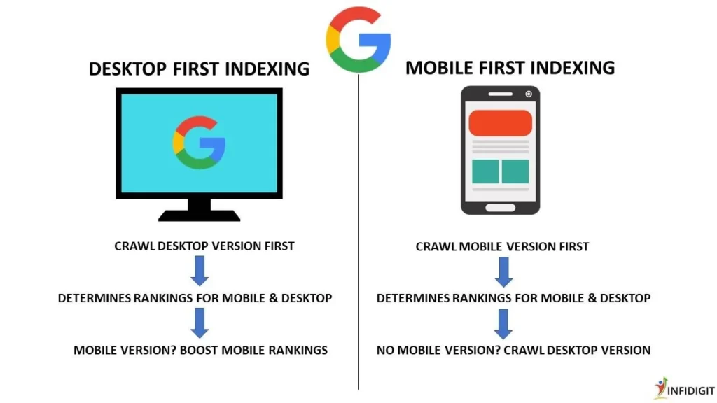
One of the biggest reasons to consider the Mobile First approach is Google’s Mobile First Indexing. Since 2019, Google has officially switched to using the mobile version of a website as the primary version for indexing and ranking.
This means that when Google’s crawlers visit your website, they look at it through a mobile browser first. If your mobile experience is poor — slow loading, broken layouts, missing content — your search rankings will suffer, regardless of how great your desktop version looks.
Here are the key SEO benefits of Mobile First design:
- Faster Core Web Vitals scores — Google measures LCP, FID, and CLS on mobile
- Lower bounce rate — Users stay longer on mobile-optimized sites
- Better crawlability — Google bots prefer clean, minimal mobile HTML
- Higher conversion rates — Mobile-friendly sites convert better on smartphones
- Featured snippets — Structured, clean mobile content is more likely to appear in rich results
💡 Pro Tip: Use Google’s free Mobile-Friendly Test tool to check if your website passes Google’s mobile criteria.
Advantages and Disadvantages of Mobile First Design
✅ Advantages of Mobile First Design
1. Better Performance Since Mobile First starts with minimal CSS and adds complexity for larger screens, websites tend to load significantly faster on mobile devices. Speed is directly tied to both user experience and SEO rankings.
2. Google SEO Advantage As mentioned above, Google uses Mobile First Indexing. Therefore, a mobile-optimized website will naturally rank higher in search results than one that isn’t.
3. Forces Content Prioritization When you design for a small screen first, you are forced to decide what truly matters. This results in cleaner layouts, better content hierarchy, and more focused messaging.
4. Future-Proof Design Mobile usage is only growing. Building Mobile First ensures your website is ready for the present and the future.
5. Improved User Experience Mobile First design inherently creates a smoother experience for the majority of your visitors — since most users access websites through phones.
❌ Disadvantages of Mobile First Design
1. Limited Creative Freedom Initially Starting with a small canvas can feel restricting for designers who want to explore complex layouts and rich visual elements.
2. Desktop Experience Can Feel Stretched Sometimes, a design built for mobile can feel sparse or too simple when scaled up to a large desktop screen.
3. Requires More Planning You need to clearly define your content hierarchy before designing, which adds planning time upfront.
Advantages and Disadvantages of Desktop First Design
✅ Advantages of Desktop First Design
1. Greater Design Freedom Designers can explore rich, complex layouts, multi-column grids, large images, and detailed navigation systems from the start.
2. Better for Complex Interfaces Tools like dashboards, analytics platforms, code editors, and admin panels are naturally better experienced on a desktop. Desktop First makes more sense in these contexts.
3. Established Workflow Many design teams, especially older ones, are more comfortable with Desktop First workflows and have existing component libraries built around this approach.
❌ Disadvantages of Desktop First Design
1. Poor Mobile Performance Desktop-heavy websites often load slowly on mobile because all desktop styles and assets are downloaded first, even if they’re not used.
2. SEO Penalty Risk With Google’s Mobile First Indexing, a website that deprioritizes mobile can rank lower in search results — directly hurting your organic traffic.
3. Harder to Simplify Later It is much harder to scale a complex desktop design down to mobile than it is to scale a simple mobile design up. Developers often end up hacking styles to make things “fit” on small screens, resulting in a poor mobile experience.
When Should You Use Mobile First Design?
Mobile First is the right choice in most modern scenarios. Specifically, consider it when:
- Your audience primarily uses smartphones — Check Google Analytics. If more than 50% of your traffic is mobile, Mobile First is essential.
- You are building a blog, news site, or e-commerce store — These content-heavy platforms are predominantly accessed via mobile.
- SEO is a top priority — If you want to rank on Google, Mobile First is non-negotiable.
- You are starting a new project from scratch — Building Mobile First from the beginning is always easier than retrofitting it later.
- You are targeting audiences in India, Southeast Asia, or Africa — In these markets, mobile-first internet usage is extremely high.
When Should You Use Desktop First Design?
Despite the rise of mobile, there are still legitimate use cases for Desktop First design:
- You are building a SaaS dashboard or admin panel — Complex data tables, drag-and-drop interfaces, and multi-panel tools work best on large screens.
- Your analytics confirm desktop dominance — If your data shows 70%+ desktop usage, focus there first.
- You are designing for enterprise software — Tools like project management systems, CRMs, and ERP software are used on company desktops.
- Your content is highly visual and layout-dependent — Magazines, portfolio sites, and design agencies sometimes prioritize desktop aesthetics.
How to Implement Mobile First Design Step by Step
If you have decided to go Mobile First, here is a simple step-by-step process to follow:
Step 1: Define Your Core Content and Features
Write down the absolute essentials your user needs. Remove everything else. On a 375px screen, every pixel matters.
Step 2: Sketch Mobile Wireframes First
Use tools like Figma or Adobe XD to wireframe your mobile layout. Focus on a single-column layout, large tap targets, and readable font sizes (minimum 16px).
Step 3: Write Mobile CSS as the Base
Start your stylesheet with styles targeting mobile screens. Do not use any max-width media queries at this stage.
Step 4: Add Progressive Breakpoints
Layer your styles using min-width media queries. Common breakpoints are:
- 576px — Large phones
- 768px — Tablets
- 992px — Small desktops
- 1200px — Large desktops
Step 5: Test on Real Devices
Do not rely only on browser DevTools. Test on actual Android and iOS devices. Tools like BrowserStack can help you test across multiple devices.
Step 6: Optimize for Core Web Vitals
Use Google PageSpeed Insights to check your Largest Contentful Paint (LCP), Cumulative Layout Shift (CLS), and Interaction to Next Paint (INP) scores.
Step 7: Validate with Google’s Mobile-Friendly Test
Run your final site through Google’s Mobile-Friendly Test to confirm it passes before publishing.

Real-World Examples of Mobile First vs Desktop First
Mobile First Examples:
- Twitter/X — Designed around the mobile app experience first, then adapted to desktop.
- Instagram — Originally a mobile-only platform that later added desktop.
- Uber — The entire booking flow is built around the mobile experience.
- TheCommercio.com — A content-first blog that benefits greatly from a mobile-optimized layout.
Desktop First Examples:
- Google Analytics — A data-heavy dashboard built primarily for desktop use.
- Figma — A professional design tool that requires a large screen to function effectively.
- GitHub — Code review, pull requests, and file management are desktop-centric tasks.
- Salesforce — An enterprise CRM platform heavily optimized for desktop workflows.
Which One Should You Choose in 2026?
After examining Mobile First vs Desktop First in depth, here is the straightforward answer:
For most websites in 2026 — choose Mobile First.
Here is why:
- Mobile devices account for over 60% of global internet traffic.
- Google ranks your mobile site first.
- Mobile-first websites load faster, rank higher, and convert better.
- Building mobile-first from scratch is easier than retrofitting it later.
However, if your specific audience, product, or platform is desktop-centric, then Desktop First still has its place. The key is to always let your data and your users guide your decision — not trends alone.
The ideal modern approach is actually a combination: Mobile First design with a thoughtful desktop enhancement layer. Start lean, add richness progressively, and test across all devices before launching.
FAQ
❓ What is the main difference between Mobile First and Desktop First?
Mobile First starts the design process from the smallest screen (mobile) and scales up, while Desktop First starts from the largest screen (desktop) and scales down. Mobile First uses min-width media queries, whereas Desktop First uses max-width media queries.
❓ Does Google prefer Mobile First design?
Yes. Google officially uses Mobile First Indexing, which means it primarily uses the mobile version of your website for crawling, indexing, and ranking. A poor mobile experience can negatively impact your SEO rankings.
❓ Is Mobile First design harder to implement?
Mobile First is not necessarily harder, but it does require more strategic planning upfront. You need to define content priorities before you start designing. However, in the long run, it produces cleaner code and better performance.
❓ Can I use both Mobile First and Desktop First in the same project?
Technically yes, but it is not recommended as it leads to inconsistent code and maintenance challenges. It is better to choose one approach and apply it consistently throughout the project.
❓ Which approach is better for SEO in 2026?
Mobile First is clearly better for SEO in 2026. It aligns with Google’s Mobile First Indexing, produces faster load times, and reduces bounce rates — all of which are important ranking factors.
❓ Is Mobile First design the same as responsive design?
Not exactly. Responsive design is a broader concept that means a website adapts to any screen size. Mobile First is a specific strategy within responsive design that determines the order in which you design and code those adaptations.
❓ What tools can I use to test Mobile First design?
You can use Google’s Mobile-Friendly Test, Google PageSpeed Insights, Chrome DevTools Device Mode, BrowserStack, and GTmetrix to test and validate your mobile-first website.
Conclusion
The debate of Mobile First vs Desktop First is not just a design preference — it is a business decision. In a world where the majority of users browse on their smartphones, starting your design with mobile in mind is no longer optional — it is essential.
Mobile First design gives you faster performance, better SEO rankings, and a smoother user experience for the majority of your audience. Meanwhile, Desktop First still holds its ground for enterprise tools, dashboards, and platforms where desktop usage dominates.
The bottom line: start mobile, enhance for desktop, and always let your data lead the way.
If you found this guide helpful, explore more articles on TheCommercio.com to stay updated on the latest trends in digital strategy, business growth, and smart investing.
Written by Shivam | TheCommercio.com — Stay Updated, Not Outdated.